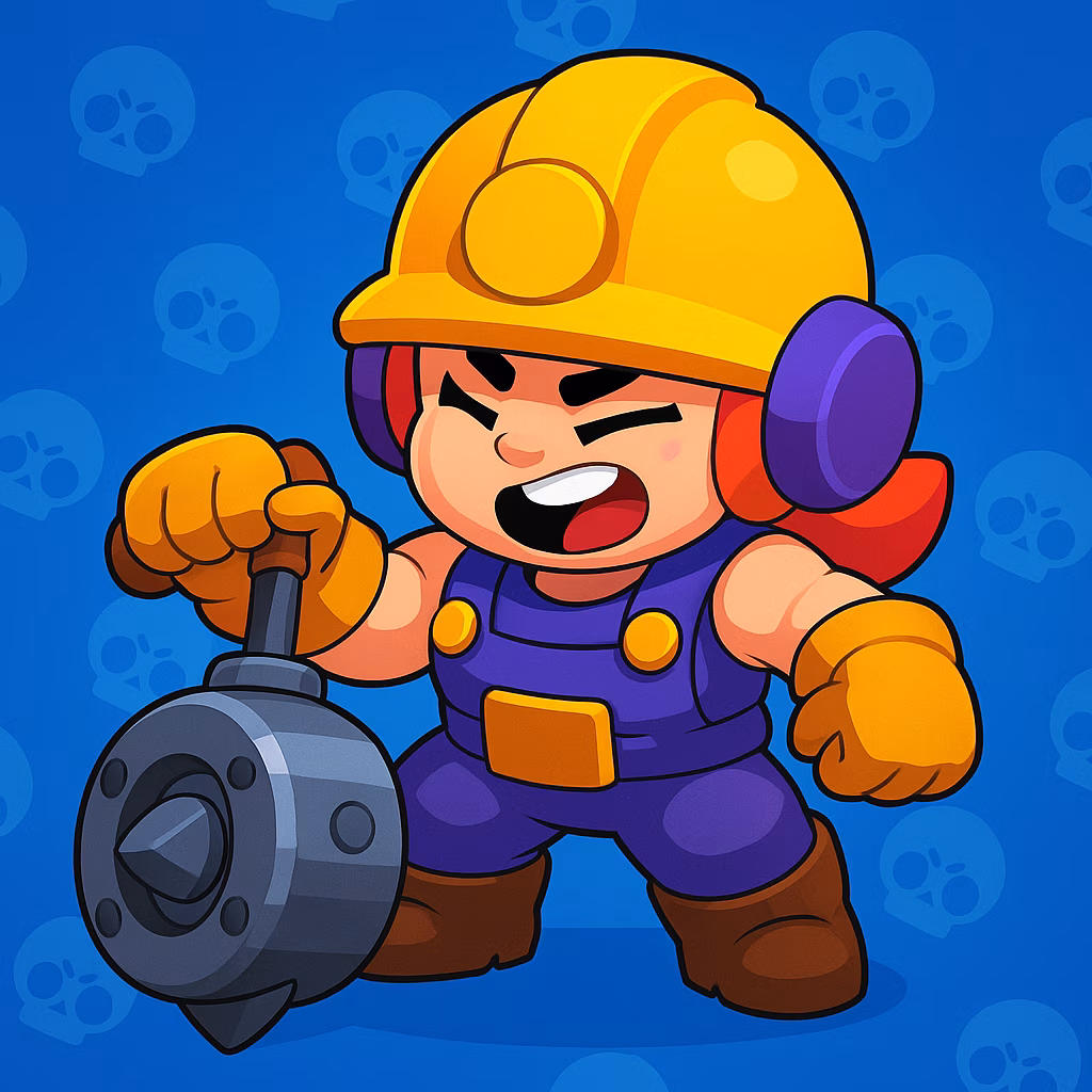
Let me set the scene. It's 2026, the ranked timer is ticking down from ten seconds, and I'm frantically swiping through my Brawler collection like a madman. I can feel the beads of sweat forming because, honestly, navigating the character select screen in Brawl Stars has become a total pain in the neck. With the roster ballooning to well over 90 characters by now, finding your main without wanting to throw your phone across the room is a miracle. But hey, there's a light at the end of the tunnel, and it comes straight from the community hive mind.
I remember a few years back stumbling upon a post on Reddit by a visionary named u/tiagocm-art, and little did I know, it would spark a revolution. This wasn’t just some half-baked idea; it was the ultimate concept to fix our collective suffering. The design was slick, intuitive, and screamed "usability." It was the UI glow-up we were all manifesting, and let me tell you, the buzz hasn't died down\u2014if anything, we're still riding that high and begging Supercell, "Pretty please, with a cherry on top, make this happen!"
The mess we currently have is real talk\u2014finding a specific Brawler feels like trying to find a needle in a haystack, especially when you are in a sweat-fest of a ranked match. The old layout isn't just cluttered; it’s a vibe killer. A fellow player, Masterdizzio, hit the nail on the head way back, basically saying the navigation was a nightmare. We're all trying to lock in our best picks, yet the interface slows us down. It's like bringing a knife to a gunfight. My pals Nitro_Kirby and WholesomeAshMain have been yelling from the rooftops about adding a simple search bar. And honestly? Facts. Imagine typing the first two letters of "Spike" and boom, there he is. It's such a no-brainer, right? It reminds me of when you're starving and just want to find a burrito on a food delivery app\u2014you don't scroll, you search!
What’s really cooking my noodle is how deep the community’s passion goes. It's not just about slapping a new coat of paint on the interface. We’re talking about deep cut, quality-of-life improvements that low-key make the game feel brand new. A user named Both_Ad_8966 spilled the tea perfectly: we don't always need a flashy new event or a crossover skin. Sometimes we just want a smooth brain experience where the menu doesn't feel like a chore. Removing unnecessary upgrade clutter during the lock-in phase is a small tweak that gives major peace of mind. The creativity is off the charts, and it proves we see this game as more than just a time killer\u2014it’s a hobby we're deeply invested in.
Look at the bigger picture. Our imagination isn't limited to just UI tweaks. Do you remember the fan-made concept of “Brawl Stars Ultimate”? It was this glorious unicorn of a sequel pitch that promised revamped classics like Gem Grab with a twist, plus full cross-platform action on Windows 11 and the Nintendo Switch. While that was pure copium, it showcased the BDE (Big Dreamer Energy) we have. Practicality, however, is king. Significant_Ad_1626 made a great point about how a clean selection screen actually impacts high-level strategies, like boosting Hypercharges efficiently without the menu lag messing up your mojo.
Being a try-hard myself, I've had to rely heavily on third-party tools to get my edge. Websites like PL Prodigy have been absolute GOATs for drafting team comps. If you want to know the current meta without getting roasted, the community tier lists over on IGN help sort the wheat from the chaff\u2014highlighting who’s cracked (like Leon still somehow being a terror) and who’s falling off. Even the esports scene inspires us to care more about the interface. Watching legends like the Canadian pro Matthew "OG" Arellano dominate makes you realize that every millisecond in the draft phase counts.
I even took the Beano Brawl Stars quiz the other day during maintenance downtime, and it hit me how much random lore we’ve consumed over the years. The UI should celebrate that connection, not obscure it. As of 2026, the chatter on Discord and Reddit hasn't stopped. The consensus is crystal clear: we want the devs to swipe right on tiagocm-art's concept. A sleek, no-nonsense selection screen is the endgame. As Si-Guy24 perfectly summed up, the urgency is real for ranked matches where time constraints are brutal.
Spilling all this tea just gets me hyped. The Brawl Stars community isn't just a player base; we're a bunch of backseat developers hoping to turn a great game into a flawless experience. If we can just get that search bar and a layout that doesn't look like a desktop messy enough to give you anxiety, we'll be cooking with gas. Fingers crossed 2026 is the year the UI gets the legendary treatment it deserves! GG! 🚀💪
Comments